Travel brands understand better than anyone that it’s more fun to live on the move. By adopting mobile marketing techniques, these companies are recognizing consumer demand for a truly multichannel customer experience.
This post will examine the seven most effective examples of travel brands reaching customers with relevant mobile marketing. We’ll look into specific mobile techniques like in-app messaging, push notifications, mobile email and responsive landing pages.
#1 Airbnb – In-App Referral Landing Page
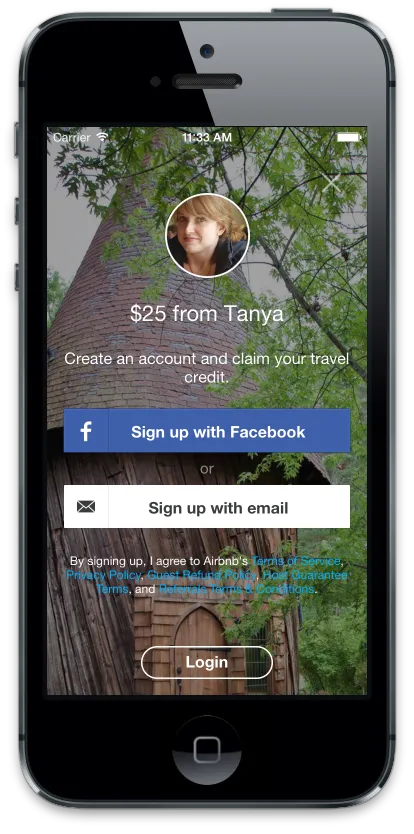
Airbnb makes it easy on users to bridge the activation gap and start using their app with this responsive mobile landing page. With a strong hero image to communicate the value within the app, the brand greets potential users with a friendly face and a pared-down design to make enrolling a breeze. In the ever-more mobile world, having web pages adapted to each device is critical.
The copy here is value-forward and direct, concise to the point of being visually appealing – it’s cut to fit the screen. The calls to action (CTA) are a must-see and there are only two real options: signup or login.
The design hierarchy has large, actionable CTA boxes to make the choice easy for first-time users.
Already having optimized for mobile app conversions, Airbnb uses referrals to great effect to maximize engagement. Aiding in this is the simplified set of sign-up options. A quick email or an even quicker Facebook sign in glosses over the only technical aspect of signup and prepares the user to book immediately.
#2 TripAdvisor – Triggered Push Notification
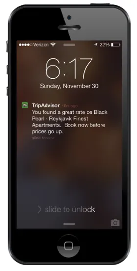
TripAdvisor uses push notifications in a fashion similar to Airbnb’s onboarding process. Even for the self proclaimed “World’s Largest Travel Site,” remaining top of mind (and within the top three) with users, is the apps biggest challenge.
The travel industry giant makes short work of providing benefits to users on their home screen. Extra points for their use of the bright green, familiar logo icon to instantly relate feelings of brand loyalty and enthusiasm.
Push notification strategy is a touchy subject and requires a degree of finesse, as these notifications are seen by permission only; once viewers disable messaging, the app is on the way out the door. Drawing users in with personalized language (e.g., “You found”) gives the copy immediate relevance and punch while following up with information users have requested.
With push notifications, space is at a premium and attention spans are short – and easily upset. TripAdvisor uses only two sentences in the message, finishing with a sense of urgency and action-specific language to drive results. Scarcity leads to demand, so brief copy is essential to relating the necessary data and drawing users into another round of engagement.
#3 Busbud – Mobile Refer a Friend Email
(Source)
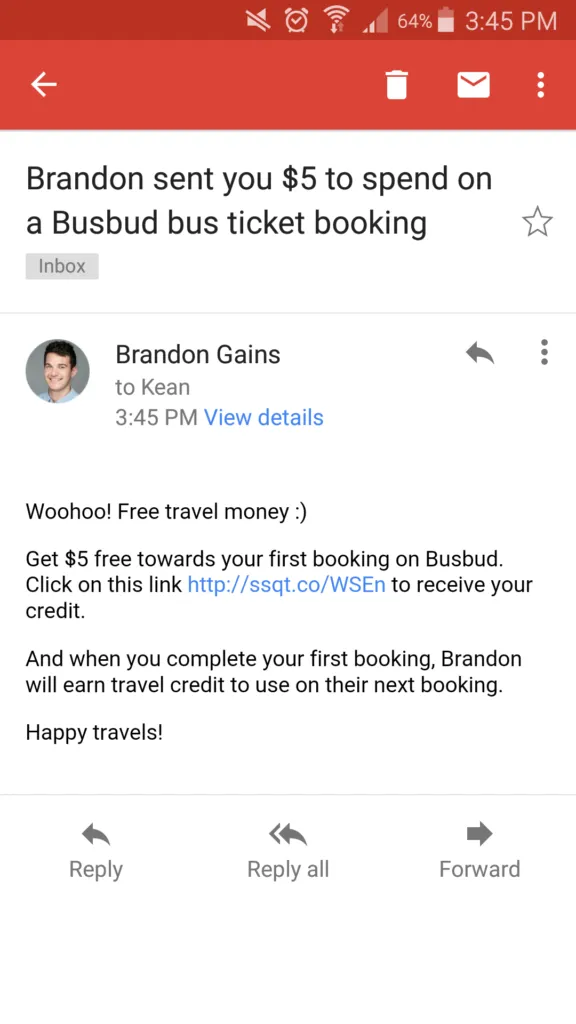
Travel marketplace Busbud uses ore-filled share messaging to encourage mobile referral engagement. First, the personalized subject line references both the reader directly and their buddy’s awesome gift, creating an immediate incentive to open.
Secondly, the brand uses exciting, yet aptly, informal branded tone to give readers immediate value: “Woohoo! Free travel money!” Capitalizing on early stage good energy, the best brands are willing to give to their audience before receiving usership, a major psychological cornerstone ofmobile optimization.
One clear, action-driven CTA initiates the click-sequence and converts new users. The message also highlights the reciprocal benefits of the campaign appealing to a consumer in a different way than single-sided offers. This is the self-affirmation theory of psychology at work, effective at creating the desired conversion action.
Mobile marketing doesn’t rely on words alone, so the bright color red plays a big part in communicating the excitement and energy Busbud would like to inspire in the user’s action. Color theory is a huge part of mobile marketing, playing along as the perfect complement to the essential use of succinct, powerful copy.
#4 Uber – In-App Mobile Messaging
(Source)
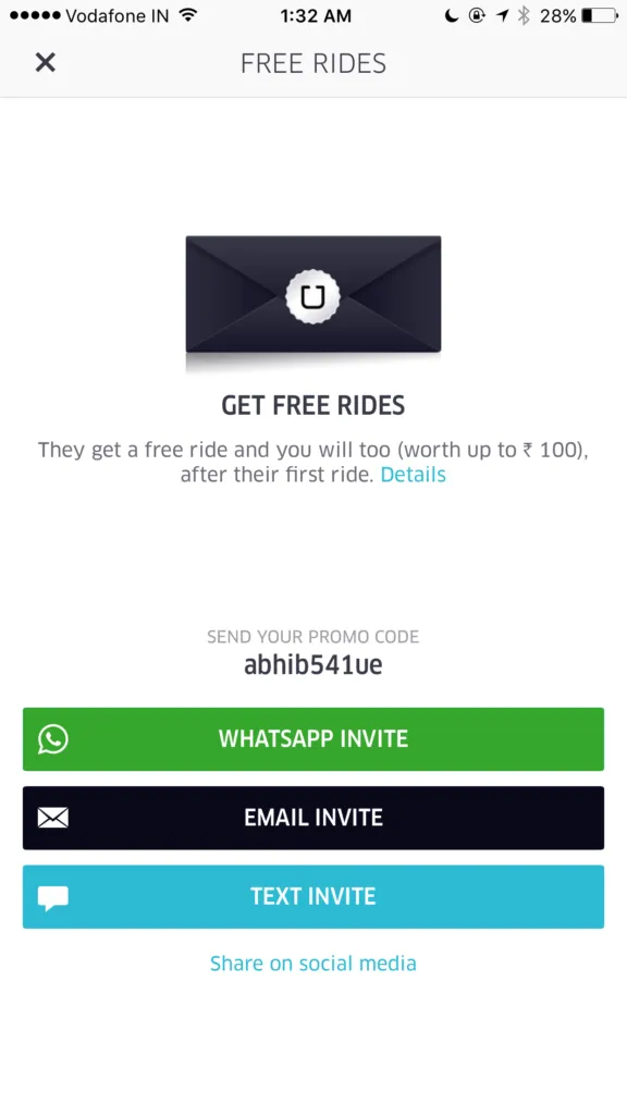
Uber is a great example of how to employ in-app messaging for increased engagement and conversions. The white background is crisp, minimal and allows the bright CTA buttons to shine in the user interface. The vivid and simplistic aesthetic shows in no uncertain terms that it pays to share the love of Uber with friends.
The secretive black envelope implies exclusivity and confidence, while contrasting with blues indicating upbeat loyalty and greens for security and trust. The effect is an overall alluring combination from which users get to choose.
“Free” and “Invite” are the most prevalent ideas here. These power words allude to the exact benefit waiting for both the giver and the receiver. Uber’s balance of reciprocal rewards is not only explicit in concise copy, but reinforced by bright and direct social share CTAs.
A prime example of referral programs optimization done right, Uber illustrates a perfect blend of actionable language, personalized copy and powerful design elements used with restraint within the physical constraints of a mobile interface.
#5 United Airlines – Contextual Push Notification
Research shows that push notifications get a 50% higher open rate than emails, while 68% of user have them activated across their apps. Personalized messaging is the way to avoid being ignored or uninstalled.
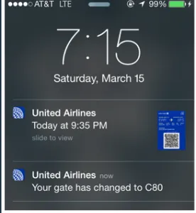
United Airlines provides a great example of how to optimize by individual user: Create hyper-relevant, time sensitive material to improve lives. Through improving an overall customer experience, the air carrier is guaranteeing more engagement while retaining loyal customers. Next time, these notifications might contain a special offer and the user at the other end will be more likely to buy.
Urgency is the theme, but the calming blue logo icons and scan-ready ticket provide great structure and balance to the message. Providing the ticket for use is the key element, making this correspondence well worth the while of any traveller concerned with saving time and getting the most current itinerary information.
United uses direct copy like “Today” and “Your” to take the lead and guide users to a simple understanding with no wasted effort. Without extra content, these are obviously meant to add ease and value. In turn, this reduces decision fatigue and increases engagement with their service.
#6 Airbnb – In-App Messaging Consistency
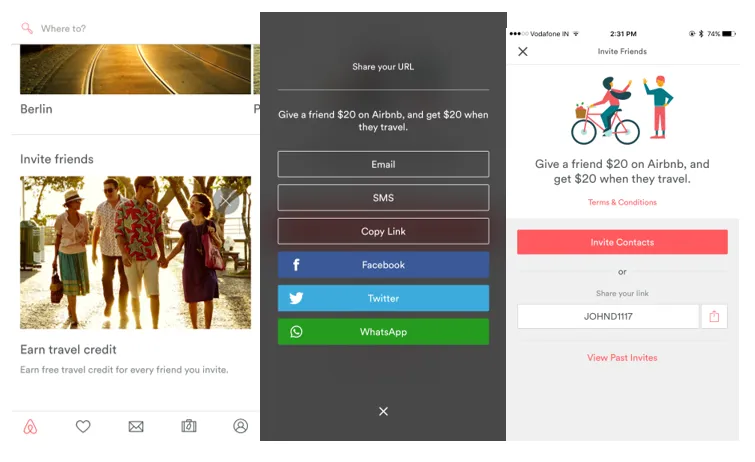
Here’s the holistic view for Airbnb’s in-app referral process. The aesthetic consistency is worth replicating – users move from a clean and minimal in-app referral screen to a secondary page of almost identical CTA size and style – only the colors are different. We can see here how crucial design hierarchies are to effective UX on small screens.
The first page makes good use of three alternating bold and muted colors, matching the referral selection interface at right. The center share page switches color palettes while keeping the copy as a clear reminder for selecting the proper social share CTA. Every element is friendly, consistent with their brand and one click away from completion.
One-click actions are particularly important for facilitating shares and conversions. Like using auto-fill forms, reducing friction in the app and guiding users through an almost effortless funnel is what optimizes conversions.
#7 Uber – Responsive Mobile Web Page
(Source)
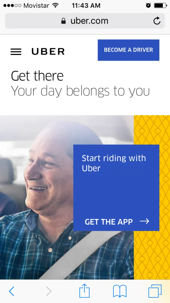
People love to see people smiling – and this cheery hero image features a happy rider and his patron. Uber’s mobile landing page smartly plays into our social dispositions while simultaneously communicating the brand values that connect users with good folks and a better ride experience.
As a person-to-person rideshare service, the company runs on the reciprocal drive to serve others and receive benefits in return. Referral programs thrive upon this very element: users connecting with others, engaging in mutually beneficial exchanges.
Their page design is grounded within a simple four-color palette, most prominent of which is blue for loyalty and yellow for energy and optimism. Also, basic geometric lines emphasize the imagery and help the messaging pop.
The word choice is targeted for action, focusing on the benefits of arriving at your destination and enabling the app do this for you … all while sharing smiles and saving time. Secondarily, visitors are prompted to become drivers themselves, the other aspect of Uber’s service that the company isn’t going to let slip from view.
In Closing
These have been seven examples of mobile marketing techniques for the travel industry. In examining brands from Airbnb to United Airlines, we’ve seen how to use tactics such as mobile email, responsive webpages, push notifications and in-app messaging to deliver a strong customer experience.
Offer your customers a consistent brand experience that is personalized to their unique customer journey. Ultimately, step into the shoes of your on-the-go audience and ask yourself: Does it help me go places? Would I use it on my next trip?
 (
( (
( (
( (
(
No comments:
Post a Comment