Thursday, 5 August 2021

The Psychology of Colors in Marketing


The power of colors in marketing can not be underestimated. Companies make use of color combinations to appear more visually appealing to consumers. Color theory is utilized to influence a consumer’s desire to buy an item. The color, look, and feel of a product can affect a consumer’s desire to buy an object by 93%. Let’s dive deeper into the psychology of colors in marketing.

So, what is color psychology?

Color psychology is the study of how colors are known to impact a consumer’s perception and behavior. In marketing, colors leave an impression on consumers and can ultimately sway their decision towards buying a product. For the success of a new product or brand, a marketing manager should understand the meaning of colors in marketing and branding.

Studying the psychology of colors in marketing should be taken into account before any major rebranding or product release. This is because the initial impression of a product, which relies largely on the color, can lead to tipping the scales in the brand’s favor.

The effects that individual colors have on consumers:

With the influx of new brands and products that keep cropping up in the market, it is vital to make your brand as visually appealing as possible. In marketing, first impressions can lead to a greater level of consumers being interested in your brand. Understanding the science of colors in marketing will help make your message and brand stand out

Check out these 4 ways through which your brand can make a killer first impression.

Making use of the psychology of colors in marketing and understanding its nuances can take your brand above and beyond. Listed below are some of the major colors that are used in marketing, as well as their psychological underpinnings:

#1. Red: Red is perhaps one of the most popular colors used in marketing. The psychology of color red in marketing has an intense appearance that catches the eye of individuals and it is thought to increase appetite, symbolize intensity and passion.

In marketing, the color red induces a sense of urgency in the onlooker and targets impulsive shoppers the most. It is used by Target, Heinz, YouTube, Netflix and many fast-food chains like McDonalds and KFC.

Red in large quantities can give the brand an angry or aggressive vibe. Overindulgence in the color red should be avoided for this very reason.

Red is a fairly gender-neutral color with women tending to prefer it slightly more than men.

Here’s how Target used red in its branding strategy:
target logo

This simple bullseye has been so effective because you’ll notice consumers no longer type out the brand’s name.

Instead, they use this symbol when talking about Target, and the color red plays a huge role in this because it’s intense which makes it unique.

Similarly, you’ll note an interesting thing about Coca Cola’s logo:
coca cola logo

Despite changes in the font of the logo over time, the one thing that remained consistent about Coke’s logo is the color red.

That’s because our brains process visuals 60,000 faster than text, which is why colors get imprinted on our minds.

Coca Cola’s red logo portrays love and happiness (which only true Coke addicts can understand!).

It’s one of the few brands that has pulled off marketing an intangible feature of a tangible product.

#2. Yellow: Yellow is thought to be the happiest color on the spectrum, and it is linked to the increase in positive and friendly feelings. In marketing, yellow is used to represent clarity, optimism, and creativity.

For this very purpose, yellow is marketed towards a younger audience, as it is the color that infants react to the most.

It is among the most psychologically complex colors on the spectrum and stands out quite a bit.

Using the right balance of yellow can succeed in gaining attention from window shoppers.

Yellow is used by DHL, IKEA, and CAT. If yellow is used excessively, then it can signify fear, caution, anxiety, and even irrationality. That’s why so many hazard signs have yellow backdrops!

dh logo

Men tend to prefer yellow more than women, and it can be even more effective if it is used with darker colors.

#3. Blue: The psychology of color blue in marketing is thought to curb appetite and lend an air of sophistication to a brand. It promotes a sense of security and is often used in office spaces to impart an air of calmness.

Blue is a very non-invasive color, and in gendered marketing, it is targeted primarily towards men.

The color blue is used to retain a greater number of customers and increase brand loyalty. It is used most famously by Facebook, JP Morgan, LinkedIn, and Dell.

Excess usage of the color blue can make the branding look cold, unfriendly, or even emotionless.

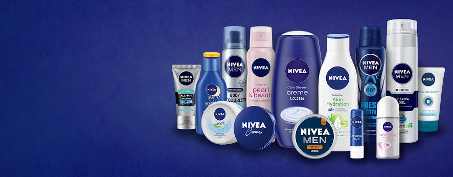
 For instance, Nivea heavily uses dark blue for a wide range of its products. Note how some products targeted towards women like Pearl and Beauty are predominantly colored baby pink.
nivea logo

#4. Orange: Orange is used to signify enthusiasm and warmth.

Brands that use orange as their major color can be associated with economically priced goods.

Orange can be utilized like a call to action as it instills shoppers with a sense of urgency. Thrift stores like Payless, Home Depot, and Amazon make use of orange to entice impulsive shoppers.
payless logo

An overindulgence in orange can negatively impact branding by signifying frustration, immaturity, and even sluggishness. Orange is a pretty gender-neutral color, but women tend to dislike it more than men.

#5. Green: The color green is meant to showcase health and tranquility. It can even be used to imply new growth or signify wealth.

Generally, it can be used in marketing for eco-friendly, or healthy brands. Green is used by the Holiday Inn, Land Rover, and Whole Foods.

whole foods market logo

The color green, if used abundantly, can have some negative connotations like envy, boredom, or even stagnation. Green has some gender disparity, with men preferring it substantially more than women.

#6. Purple: The color purple denotes royalty, success, and wealth. It is said to have a calming effect in marketing and is used by cosmetic brands quite frequently.

Purple lends an air of sophistication and luxury to any product and it is used by Cadbury, Hallmark, and Syfy.
cadbury logo

Purple in large quantities is thought to indicate moodiness or even suppression, so it is important to not go overboard with this particular color.

Purple is shown a clear preference by women and additional tints to it can make it even more feminine.

#7. Black: Black is used to enhancing a company’s sense of sophistication, class, and power. It is a relatively subdued color that is still quite attention-grabbing.

It can be marketed towards consumers that are a bit more reserved.

High street brands like Hugo Boss, Puma, and Gucci use this color heavily.

gucci logo

If black is used excessively, then it can negatively impact the branding by denoting coldness, oppression, or even mourning.

Black is quite gender-neutral and no clear preference is shown for this color. It is thought to be more suitable for some industries like fashion.

#8. White: White or silver colors can amplify the feeling of cleanliness, purity, and lend a minimalistic air to a product. In marketing, white is used a lot as a contrast and can declutter the branding of a product.

Brands that utilize the color white include Adidas, Sony, and Apple. If white or silver is used in excess however, it can give off a sterile or empty feeling, so it is important to use white sparingly.

As white is a fairly neutral color, it is not particularly liked or disliked by either gender.

The Adidas logo is super simplistic, which highlights the minimalistic and functional element of the sports brand. Set against a backdrop of black, the white becomes much more eye-catching.

adidas logo

#9. Magenta: Magenta, or pink, is the color that is most highly associated with femininity. It can also be used with other colors to add a more youthful look to the brand.

Magenta is a positive color and can inspire consumers with imaginative, caring, or creative air. If used in excess, however, it can signify impulsivity or rebelliousness.

Some brands that make use of magenta include Barbie, Victoria’s Secret, and Cosmopolitan.

barbie logo

Why the Psychology of colors in marketing doesn’t always work

Although it may seem fairly simple to make use of the psychological effects that individual colors invoke, the color theory can be up for debate. The fact of the matter is, the effect of each color can have a vastly different impact which depends on an individual’s own set of experiences. Aspects such as culture, preferences, and even upbringing can result in the same colors having vastly different effects on people.

For instance, the color green is said to instill a sense of calm and tranquility in a person. However, its effect is highly reliant on the context it is being used in. Green can, therefore, be used to bring awareness to environmental issues or it can also be used to signify wealth and finances.

Similarly, brown can give off a rugged appeal for brands like Hollister. In different contexts, it can be used in collaboration with other colors to give a more inviting or indulgent feeling like chocolate advertisements.


The important thing to remember is that there are no best colors to use in marketing. However, there are ways to decide which colors will suit your brand the most.

Choosing the right color for your brand

When choosing the color for your brand, you should pick something that fits your product or signifies what your company stands for. In order to make the best decision, conducting a small customer survey can really help you understand which colors the majority of your audience react positively towards. Consumer research will help you get a better understand of the psychology of colors in advertising and marketing, including how to use the psychology of colors in marketing and branding.

To get a better understanding of this you must answer some questions:

#1. What does your brand stand for?

In choosing a color for your brand, you should take note of your brand’s personality. The colors of your choosing should align with what the brand stands for.

To pick the right color, you can try to figure out which niche your brand fits in. Does your brand’s personality denote sophistication, excitement, competence, ruggedness, or sincerity?
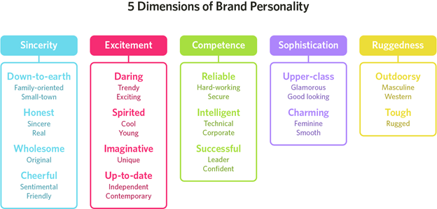
#2. What is your brand’s target audience?

Another major point of note is your brand’s audience. Is it comprised mostly of men or women?

Different colors in the spectrum can target different genders. It is up to your discretion whether your brand would benefit from sticking to the gendered norms or if it went against the norms and chose colors that can improve your brand’s individualistic nature.

The figure below outlines the colors that are favored the most by men and women:
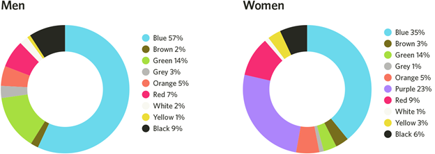
graph showing popular colors that attract attention from men and women.

#3. What is the branding color of your major competitors?

Another way to stand out amongst the crowd is to make note of the branding colors of your competitors. By choosing colors that are dissimilar from your competition, you can carve your brand’s niche in the market and create your own audience.

For instance, the main branding colors for McDonald’s are red and yellow, but Taco Bell’s colors are purple. Taco bell, which became a fast food chain much later than McDonald’s, made use of the purple more predominantly so it could stand out when compared with competitors like KFC and McDonald’s.
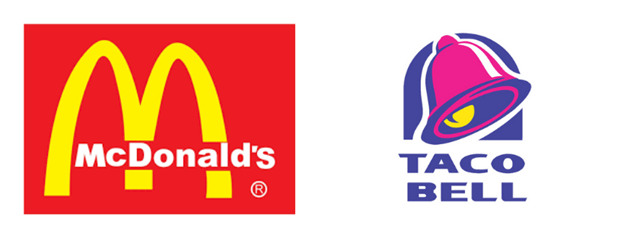
mcdonalds and taco bell logo

#4. What are the names of the colors you are choosing to represent your brand?

Colors do have a major impact on a consumer’s first impression. But the name of colors can also elevate your brand substantially.

For instance, although the colors brown and mocha are essentially the same, consumers being surveyed favored the color mocha more. This trick is used often by makeup and cosmetic brands to improve a brand’s relatability and attractiveness.

For instance, the makeup palette pictured below has a wide range of shades that can be used for everyday looks. Yet colors like lilac are named “Magic” and other neutral colors like brown are called “Stunner” or “Opulent” or “Mystic”.

Naming the colors like this can lead customers to react to the palette in a more positive way. It can also make the product more attractive as compared to a palette with simple shade names like brown or blue.
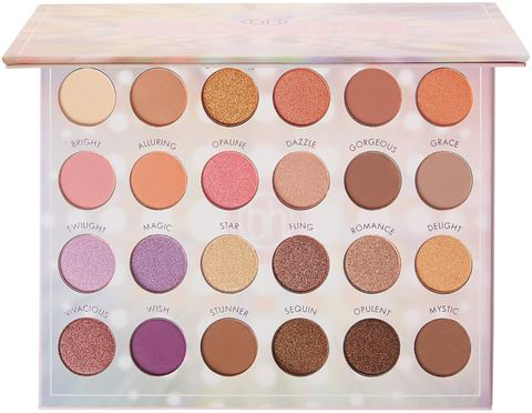
make up showing the psychology of colors in marketing

Choosing the Right Color Schemes for your brand:

#1. Monochromatic: Making use of a singular color in varying shades can be easy on the eye, and is often used online. It can give your brand a minimalistic yet sophisticated design.

#2. Complementary: This particular strategy employs two colors from the opposing ends of the color wheel. This can draw onlookers and is suitable for your brand if you want to show off a wider range of products.

#3. Triple Color Scheme: This method uses three colors that are equally spaced on the color wheel. The usage of such colors can showcase a harmonious effect. It can be implemented to create a bolder outlook for your brand.

Perception of Color:

Color studies show that varying tints and shades can induce different reactions from men and women. Adding black to colors can result in darker shades while adding white to colors results in softer, lighter shades.

Males reacted more positively to bright colors and females favor soft colors

The results of using the psychology of colors in marketing:

It cannot be said that color is the sole deciding factor that can lead to your brand’s success. This is because it is a combination of marketing techniques and online branding techniques that can ultimately help your brand be successful.

It is, however, undeniable, that making use of the psychology of colors in marketing can help your brand receive much-needed recognition. Various studies conclusively state that ads that are colored perform 42% better than those same ads without color. Brands that understand the psychology behind colors in marketing have recorded significant success when they launch a new product.

Ultimately, nearly 80% of consumers hold the belief that colors help make a brand gain more recognition while 90% of consumers state that their first impression of a brand or product was based largely on color. The colors that you choose to identify your brand with can even influence a consumer’s retention and purchasing patterns. 52% of customers will not return to a store if they don’t like the aesthetic of the store.

Marketing on online platforms is widely different from in-print marketing. Make sure to do your research and learn how to appropriately market your e-commerce venture.

What is the psychology of colors in marketing?

Color theory can be used to influence a customer’s desire to enter your store or buy an item. The look, color, texture and feel of a product can affect consumers’ desire to buy objects by 93% or more.

What effect does the psychology of colors in marketing have on consumers?

Different colors affect people in different ways, and can be used to drive customers both toward and away different places and products. For instance, the color red symbolizes appetite, intensity and passion, and is thought to induce a sense of urgency in the onlooker.

How do I use the psychology of colors in marketing to attract customers to buy?

While you can use the color red to symbolize intensity and urgency, other colors like yellow can mean happiness, clarity or optimism. Orange is a warm, enthusiastic color that often signifies discount brands. And green can signify health or eco-friendliness, making it a good color to associate with healthy or environmentally conscious brands.

Does using the psychology of colors in marketing work?

Just making a product a certain color and expecting people to buy it rarely works, but used in conjunction with other design elements like space, shape, texture and more, you can create a winning combination that will draw people to your product.

Original Post: https://expresstext.net/blog/psychology-of-colors-in-marketing/


Thursday, 22 July 2021

The Impact of Artificial Intelligence on Corporate Decision Making

Artificial intelligence was primarily a science fiction subject for decades, but it has dramatically changed nearly every industry over the past years and decades. In fact, the percentage of businesses that use or plan to use AI rose from 10 percent to 37 percent in just four years from 2015 to 2019.

In this article, we’ll take a look at how artificial intelligence and services such as the ai-powered bi tool are changing the way businesses around the world approach key organizational decisions. While we’re only beginning to scratch the surface of artificial intelligence, it’s clear that AI will play a major role in both consumer and business applications throughout the 21st century.

AI and Efficiency

Before artificial intelligence and machine learning tools were widely available, businesses often had to invest substantial resources into research and data collection. These were far more expensive and time-consuming than contemporary AI solutions, and they were at a significant disadvantage when it came to the results.

Today, companies that leverage AI and ML can make more accurate and agile decisions at a fraction of the cost. While these implementations work differently in each industry, artificial intelligence is transforming common practices in nearly every field.

AI in Healthcare

Healthcare is the perfect example of a sector that was waiting to be transformed by AI. By nature, healthcare organizations work with large volumes of patient data—including extremely sensitive information that’s governed by HIPAA and other regulations.

With AI, healthcare organizations can analyze an incredible amount of data and use it to find patterns that wouldn’t be identified by human employees. With that in mind, it’s no surprise that the healthcare AI industry is expected to grow by more than 40 percent per year from 2021 to 2028.

Implementing AI and Predictive Analytics

If you want to get the most out of AI and predictive analytics, you need to fully commit to understanding and leveraging those technologies. This can require significant time and money upfront, but the returns are well worth the investment.

Artificial intelligence will never replace human input—the way you implement AI systems into your practices will determine your long-term results. Effective implementation of artificial intelligence, machine learning, predictive analytics, and other cutting-edge technologies depends on buy-in at every level of your organization.

AI is growing rapidly every year, and companies that fail to adapt will quickly fall behind the competition. 

Tuesday, 20 July 2021

HOW iOS 15 RELATES TO APP DEVELOPERS

It's no secret that Apple updates usually bring about a load of work for app developers, and this iOS 15 beta version that was just released seems to be the same. 

iOS 15 has many new features that improve on the iOS 14 and make life easier for its users. These include the Focus mode, Live Text (which allows users to transcribe, copy and paste from images and camera in real-time), improvements to system apps like FaceTime, Safari, Siri, Apple Maps, and AppleWallet. All this sounds impressive and probably would make a person eager to update their iOS when it's rolled out officially sometime in Fall 2021. 

Apart from these impressive things, how does this iOS relate to developers? What impact will it have on their work?


1. Increased Memory Limit

Increased Memory sounds too good to be true. Still, it's a boon from the Apple gods for third-party app developers, as the document from developer.apple.com reveals that app developers can ask for extra memory access in special circumstances. While it's not so clear what those circumstances are, developers can look forward to designing apps with graphics that are even more detailed and in-depth. 

This feature also comes with a caveat, developers. Apple says to make sure that your app still functions properly even without the extra memory space, as they may not give this permission to everyone.


2. SharePlay 

SharePlay is Apple's cool new feature on FaceTime which allows people to share what they're watching or listening to with the people they're on FaceTime with. This tool is a good way to build visibility for your app, and media streaming apps can let users share their content through the new Group Activities API. Sharing also extends beyond video streaming. Users can share anything on SharePlay.


3. Focus 

The new Focus mode allows users to delay receiving notifications to times that work best for them. There are 4 Interruption Levels that developers can use to build apps or plug-ins to help with the more nuanced delivery of notifications.


4. RealityKit 2 

Apple's RealityKit has been upgraded, with the capability for you to build more immersive Augmented Reality experiences. They have added more post rendering effects and custom shaders to enable the AR to work smoothly without any lags. 

There's the Object Capture that helps you turn photos into 3D models that you can optimize for AR, Custom Shaders that blend virtual content with the real world to make it almost indistinguishable from reality. You also get more control over the rendering pipeline with an array of custom render materials to fine-tune the look and feel of your AR world. 

The Swift API allows you to create characters that the players can control to explore your AR world. 

The RealityKit 2 sounds like something every AR developer would love to try their hands on.


5. App Store 

The app store is not a part of the development process per se, but it's a great way to get your app visible to all Apple users. Apple has redesigned their app store with all-new features like their In-App Events, which help you publicize whatever event or promotion you're having on your app right in the app store. They curate personalized recommendations for their users, and these events will show up on these lists, in search results, and on the app product page. You can manage your App Store Connect and check how your app is doing on the Analytics page. 

You can also create custom pages for your app with different promotional texts and screenshots and direct relevant audiences to a particular page using its unique URL. There is also room for product page optimization on the new app. 

As with every new version of every operating system, the iOS 15 has updated and upgraded features that will make the lives of its users a little easier.  These features will spark the creative minds of their developers to make better, more technologically relevant, and aesthetically (graphically) pleasing apps and plug-ins. 

It's time for developers to make hay while the sun shines and get to work on the new versions of their apps optimized for this new version of the Apple iOS.


Sources: 

1. https://www.google.com/amp/s/www.forbes.com/sites/davidphelan/2021/07/09/apple-ios-15-reveals-1-super-cool-trick-for-dazzling-iphone--ipad-apps/amp/  

2.https://www.apple.com/ng/newsroom/2021/06/ios-15-brings-powerful-new-features-to-stay-connected-focus-explore-and-more/ 

3. https://developer.apple.com/ios/

4.  https://developer.apple.com/app-store/whats-new/

5. https://www.cnet.com/google-amp/news/ios-15-public-beta-release-date-new-features-and-more-about-apples-new-os/


Friday, 25 June 2021

The Two P2P Network Features That Internet Must-Have Nowadays

 Did you know that, according to Varonis 2019 Global Data Risk Report, on average, only 5% of companies’ folders are adequately protected?

The fact that various difficulties were brought with COVID-19 in 2020 drove corporations toward remote staff and cloud-based technologies where information vulnerability created a massive need for companies to improve their cyber assets or risk data loss and increment costs.

In this article, you’ll discover more about the two main reasons why the Internet urgently needs a P2P global network and the best alternative that implements this innovative technology.

Feature 1: Internet Security

Cybercrime has increased by 600% due to the COVID-19 pandemic. Fraudsters have boosted the use of sophisticated email, mobile, and computer malware armed with the knowledge that people spend more time on their electronic devices.

Undoubtedly, with the introduction of machine learning and tailored spear-phishing emails, malware attacks have become increasingly sophisticated, which generates the need to implement a P2P network to overcome. The chart below shows this tendency as well:


Let’s see each section in more detail.

1)   Email Malware

An email malware is a harmful code spread in electronic mail and can be activated when a user clicks on a link, opens an email attachment, or interacts with the infected message in some other way.

According to Purplesec 2021 Cyber Security Report, malware is sent through email in 92% of cases, so knowing how to recognize it can prevent being scammed in a non-P2P network architecture. The following are some "red flags" that suggest an email may contain malware:

1. Suspicious sender's email address: If the sender's email address is unknown or does not match an expected address for a corporation, it's likely a malware email.

2. Your username appears in the email topic or attachment: A virus email's subject box may contain your username or be blank. Your username could be included in the filename of malicious attachments.

3. Malware emails frequently include the words "warning," "danger," or "urgency" to entice recipients to respond hastily before they have had enough time to consider their options. If you receive an email that asks you to download a file to remedy an issue, be cautious.

2)   Mobile Malware

Mobile malware is malicious software meant to attack mobile devices such as smartphones and tablets to obtain personal information.

According to Purplesec, the number of new malware types for mobile devices surged by 54% in 2018, which could arguably be prevented using a P2P open network.

Here are some security tips for avoiding mobile malware:

1. Connect to a secure Wi-Fi network: When people access their private data in public places, like an airport with free Wi-Fi, the data may be accessible to criminal users sniffing wireless traffic at the same point of access.

2. Prevent Jailbreaking: Jailbreaking means breaking the device’s security model and allowing all apps, including malicious ones, to access the data owned by other apps.

3. Encrypt your devices: It makes it extremely hard for someone to break and steal data by protecting your gadgets by fully encrypting the device. Setting the device and the SIM card with a secure password is essential.

3)   Computer Malware

Have you ever noticed strange cases of image pixelation or random windows popping up on your screen? Or maybe you heard weird sounds? If your answer is yes, there is a high chance that malware or virus may have invaded your machine, making the use of a P2P virtual network urgently required.

According to Purplesec, macOS malware grew 165% over the last year, and Windows development rates for malware dropped from an all-time high to 11.6%.

However, there are precautions you can take to avoid this kind of malware:

1. Update your antivirus: You must make sure that your apps, antivirus software, and operating system are up to date to prevent your computer from becoming infected.

2. Automatic virus scanning: Your antivirus software should contain automated functions allowing continuous scanning of your machine against viruses and performing cleanup.

3. Reboot in safe mode: Safely starting your computer offers you the opportunity to run your antivirus program and look more closely at the (potential) problem.

Feature 2: Decentralized Data

There are several examples of massive sales of data from major technology companies to third parties previously seen, making it urgent that data is spread in a fully decentralized internet now.

When someone provides personal information to a company or any governmental entity, most people do not understand how it is used and stored nowadays, which produces concerns about the potential risks that data can suffer when stored in centralized data centers.

Let’s see the differences between centralized and P2P open network.

1)   Centralized Data Storage

Did you know that 80% of the world’s data currently resides in hyperscale data centers in central locations concentrated in 20 companies?

Centralized data storage systems are built on a central server where authorized persons can manage the information to make possible data traceability.

One of the most significant disadvantages of centralized data storage is that it has deficient privacy standards, making it easier for third-party participants to access data through hacks.

2)   Decentralized Data Storage

A decentralized cloud crypto strategy involves using several separate devices linked to the network, supplied by various nodes. These nodes retain autonomous control, which allows each of them to determine its criteria for the availability of data workload.

A P2P network offers increasing data privacy and transparency, reducing processing needs which drastically decrease resource usage, making it cheaper to run within the decentralized web.

After describing these two essential features that the Internet must have now, we firmly believe that ThreeFold is the best alternative to make a more secure, decentralized, and sovereign internet.

ThreeFold Is the Best Solution to Have a Fully Peer-to-Peer and Secure Internet

ThreeFold is a peer-to-peer cloud storage solution granting substantial energy efficiency compared to existing data storage systems while letting information be 100% secure, private, and available 24/7 without exception.

This fully decentralized platform improves:

1)   Network Security

To close the enormous security gap in data centers nowadays, the ThreeFold P2P virtual network has developed its operating system called Zero-OS, which runs on the nodes. Every node is linked inside a specified network and has its iPv4 or iPv6 address, which keeps the information 100% encrypted and private to the user.

Also, the Peer-to-Peer Network uses a web gateway mechanism that allows the exposure of services to the open internet without allowing incoming connections to keep applications and storage secure at all times. This means there is no incoming TCP/IP traffic allowed from the outside.

2)   Network Efficiency & Scalability

ThreeFold’s Peer-to-Peer Network was designed to find the shortest possible path between peers and encrypt the end-to-end connection. It allows for peer-to-peer links like in meshed wireless networks. This is very different from consensus mechanisms like distributed blockchains which use more networks than centralized networks.

When you download the same file from a peer-to-peer network, using a BitTorrent platform as a starting point, the download is performed differently. The file is downloaded to your computer in bits and parts from many other computers connected to the same P2P network and already have that file or at least parts of it. At the same time, the file is also sent (uploaded) from your computer to other devices that are asking for it. This situation is similar to a two-way road: the file is like multiple small cars coming to your PC while also leaving to others when it is requested.

When it comes to file-sharing, the larger a P2P network is, the faster it is. Having the same file stored on many of the peers in a P2P network means that when someone needs to download it, the file is downloaded from multiple locations simultaneously. Peer-to-peer networks are incredibly scalable. Adding new peers is easy as you don’t need to do any central configuration on a central server.

3)   Centralized Data & Points of Failure

Nowadays, the centralized data issue is not the only problem that information management is facing. There are also central points of failure in the system, which leads to sporadic shutdowns that sometimes can last minutes and even hours.

To overcome today's colossal data centralization gap, ThreeFold has created the most optimized peer-to-peer cloud network, bringing privacy by design. All data and applications remain under the user’s control.

Therefore, a P2P global network, such as the one offered by ThreeFold, stimulates equality by blocking a substantial amount of single-player data accumulation and also eliminates the possibility of making websites around the world to be disconnected because of the internet shutdowns.