Monday, 9 August 2021

Twitter Marketing Strategy


Twitter is a pretty powerful marketing tool, but before you incorporate it into your business plan, ask yourself – do you need it?

80% of the 330 million Twitter users are millennials, so if your brand is targeting users between the ages of 18 to 49, only then should you come up with a twitter marketing strategy.  

Then comes the question of why choose Twitter over other marketing platforms. 

On Twitter, video ads are 50% cheaper and the platform’s users spend 26% more time watching these ads as compared to Facebook and Instagram, which is why video engagement is higher and that too, at a lesser price. 
Apart from that, in my own experience as a marketer, I feel that Twitter is a great platform to tell your story. 

Most of its users are highly educated and likely to trust brands that are transparent and responsible; thus, it is a great way to connect with potential and existing customers. 

If you want to effectively market your brand through Twitter, it’s not as simple as setting up a profile and tweeting regularly. 

For achieving maximum Return on Investment, incorporate these tips into your twitter marketing strategy: 

#1. Determine the number of accounts you need 

The first part of planning your twitter marketing strategy is auditing your accounts. 

This depends entirely on the nature of your brand.

If your parent brand has sub-brands or co-brands, for example, Samsung Home and Samsung Electronics, then it’s best to create multiple accounts. 

Even if you sell different product lines, for example, Nike footwear and Nike sportswear, different accounts can be more effective than a single one.

This is what marketers call Twitter lists

You might be thinking, it’ll take double the effort to gain followers – but if your audience differs, your tweet timing and frequency will also differ. 

All of this impacts customer engagement, which makes it crucial to create and maintain multiple profiles for bigger brands. 

In order to measure engagement metrics, there are a number of platforms available – the first and foremost being Twitter Analytics itself:
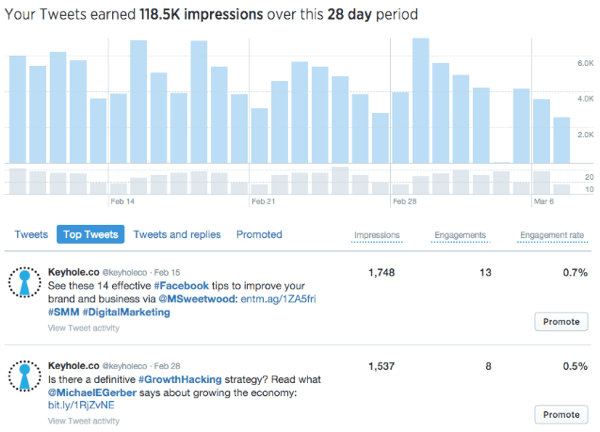
If you’re looking for a tool to provide a more detailed overview, you can go for Buffer but some features require payment. 

#2. Construct the right profile 

There are 3 things that you need for a profile that is easily discoverable and retainable in customers’ minds: 

  • Handle 

In order to fulfill the criteria above, your Twitter handle should be short and similar to your brand name, otherwise, you will end up confusing users. 

Celebrities often use the word ‘official’ in their handles because there are so many fan pages with the same names; thus, creating clarity: 

If you’re a blogger, you can also use your handle creatively to describe your profile:

Another reason why it is important to keep a short handle is that there is a 280 character limit on each tweet, so anyone who wants to retweet will avoid mentioning brands with longer handles. 

Make sure you eliminate any extra characters in your handle, for example, spaces, punctuation marks, numbers, etc.

  • Profile and cover photo 

Most guides will tell you that your profile picture is extremely important – and it is. 

But most brands go for their logo when uploading a profile picture. 

All you need to do is make sure it’s high quality, clear and not pixelated. 

The colors of your logo should also be good enough to seem appealing. 

However, the real game-changer is your cover photo (or what some marketers call the header image) – because that is what creates the first impression of a visitor which goes a long way in determining whether they will follow your brand or not. 

In this case, go all out. 

Upload the most impressive picture that is either an extension of your logo, explains what your brand does, or anything else that is relevant to your brand. 

The retail brand Target is an inspiration to all brands out there when it comes to Twitter profiles: 
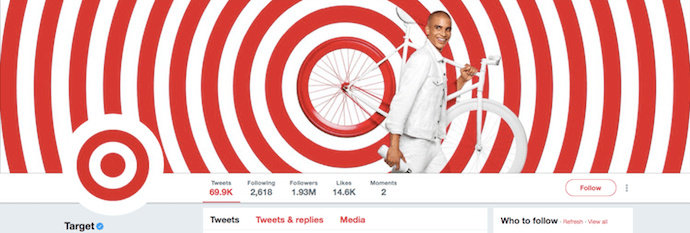
This look is so mesmerizing and gives out positive vibes due to the colors used. 

Plus, it is completely in sync with the brand’s logo (as seen in the profile picture), which is an added bonus because visitors will easily be able to retain this information; thus, increasing brand recognition. 

Similarly, British Airways opted for a simple yet elegant cover: 

A good shot of its plane is all that they needed for the right cover photo. 

It explains what the business does and reinforces the brand’s logo as seen on the plane. 

What you need to do is be creative and think out of the box so that you wow your profile visitors.  

Plus, unlike your profile picture, you need to change your header image frequently. 

It’s a great way to advertise new campaigns, products, events, etc. 

The frequency at which you should change your cover image varies depending upon the traffic that you get daily.

Changing it too often is also a bad sign because it can end up confusing visitors. 

Thus, depending on the traffic that you get, set the desired frequency at which you change your cover/header image. 

Lastly, the optimal dimensions for your cover image are 1500 x 500 pixels. 

Images uploaded on Twitter need to be under 2 MB so make sure they are compressed. 

The best file formats are JPEG or PNG.  

When uploading a cover image, make sure you fulfill these criteria for the best outlook. 

  • URL

This is a small but very crucial part of your profile. 

If visitors like your profile, they will not only want to follow you but also purchase from you.

Instead of making them carry out the effort of looking for your website, add it to your profile just below your bio: 

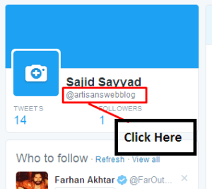
If you’re a blogger that doesn’t have a website yet, you can always create a URL through your twitter handle: 
#3. Schedule posts 

In such a fast-paced world, it’s impossible to manually handle business operations now. 

With COVID-19, everything has shifted to online marketing which makes automation even more crucial for business survival. 

Platforms like Buffer and Hootsuite allow you to schedule posts beforehand. 

Not only does this reduce your reliance on employees, but it also improves accuracy.

For example, you may forget to send out a tweet to followers wishing them a Happy Christmas, but with the help of tools for digital marketing, you can add it to your calendar in advance.  

Plus, you don’t have to be tied at the office to send out a tweet at the right time. 

You could be enjoying the holidays with family and the tweet will be uploaded automatically. 

In the long run, this will cost you much less as compared to paying employees to handle your twitter accounts. 

#4. Create a unique bio 

You have 160 characters to describe everything that your brand does, so make it count. 

Just like the pictures on your profile, your bio is a major factor in determining the first impression of visitors. 

Since you have a lot to tell and very little space to tell it, only add key points i.e. what your business does, talk about your best sellers and if you can manage to, tell your story. 

Your goal should be to create a unique bio. 

If every clothing brand talks about selling high-street fashion or casual-wear, stand out of the crowd and offer something unique which will go a long way in creating an impression on visitors’ minds. 

Plus, the best Twitter bios always have humor incorporated in them: 
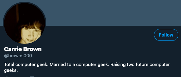
Notice how Carrie Brown managed to write full sentences while explaining who she was, a family description and all that with a touch of humor. 

#5. Timing is key

If you have any experience with social media marketing, you’ll know that every platform has peak hours and days during which, if you post something, you’ll get the highest engagement rates. 

If there’s one time you want to avoid when posting a tweet, it’s between 3-4 PM. 

The best hours, on the other hand, are between 11 AM-1 PM. Posting after 12 PM will get you the highest engagement. 

This makes sense since intellectual individuals are the majority users of Twitter who wake up and check their feed first thing in the morning or while they’re at work. 

This is also why the worst times to post are before 7 AM, especially on weekends, because Twitter is not exactly an entertainment platform as compared to Facebook and Instagram. 

The peak days to post on Twitter are weekends i.e. Friday to Sunday. 

This information is highly crucial so that you can schedule tweets accordingly for the best engagement rates. 

According to Neil Patel, some studies also suggest that peak hours to post are 4-6 PM. 

However, it depends entirely on your audience. 

If they use Twitter for fun, they’re likely to fall in the second category. 

If they’re work individuals looking to stay updated with the latest news and trends, it is best to post tweets in the morning. 

#6. Use interactive marketing techniques  

Your Twitter marketing strategy is not effective until you use the right marketing mediums. 

The platform provides much better click-through rates as compared to others, but only if your brand’s target audience is active on it. 

With that being said, you have better chances of maximizing ROI by using interactive marketing techniques like visuals and video.
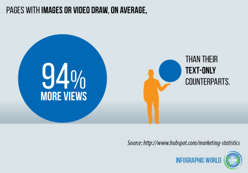
Tweets with photos are much more likely to get retweeted as compared to tweets with just text. 

Plus, video content is even more engaging than pictures, so much that it is currently on the list of the biggest marketing trends of 2020

Last year, videos accounted for 80% of all internet traffic, and the number keeps getting higher each year – which goes to show that it is a powerful marketing tool and it keeps gaining momentum so you need to invest in it as much as possible.  

#7. Trending hashtags are a must for your twitter marketing strategy 

Hashtags are like the SEO for social media platforms. 

The algorithms of platforms like Twitter and Instagram are designed to discover content with hashtags quicker, which means it ranks higher. 

You can use the Keyword Tool to find out trending keywords that have high search volume and CPC. 

It’s a paid tool, but you’ll definitely need one if you want your content to be discoverable. 

However, if you cannot afford one, a great way to use the best hashtags is to follow competitors and see what they are using. 

This will give you a better idea about the type of hashtags that are currently popular in your industry. 

Make sure you do this frequently because the most trending hashtags vary from time to time. 

Another thing you can do is to create your own hashtag.

This is your brand’s own hashtag that customers can use when they post something related to your brand. 

It’s a great way to boost user-generated content which in turn creates brand awareness. 

However, to make sure that people actually use it, you need to make it trendy enough that your customers want to be included. 
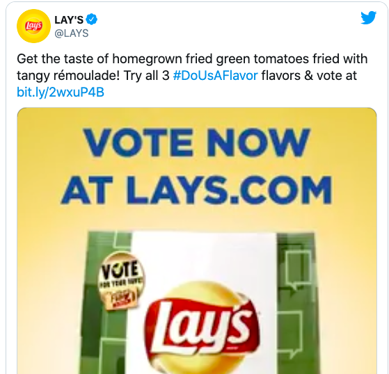
Lays came up with a witty hashtag for it’s new flavours that went viral:
  

And with that, they managed to create brand awareness at the lowest possible cost just because of a catchy hashtag. 

You’ll also notice how brands incorporate hashtags into their tweets very casually, which is exactly what you need to do: null
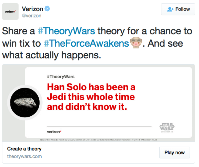
Make it sound natural enough while optimising your content for Twitter so that it ranks higher.  

Conclusion

So that sums up everything that you need to know for your Twitter marketing strategy. 

While following these steps and incorporating them into your strategy, make sure to keep in mind that every business is unique and you will have to tweak them according to your business’s needs. 

For example, posting a tweet has some set peak hours, but within those you will have to find the ones that your audience is most active in. 

Thus, use your research and development department to get to know your followers and plan your strategy accordingly.


Original POst: https://expresstext.net/blog/twitter-marketing-strategy/

Thursday, 5 August 2021

The Psychology of Colors in Marketing


The power of colors in marketing can not be underestimated. Companies make use of color combinations to appear more visually appealing to consumers. Color theory is utilized to influence a consumer’s desire to buy an item. The color, look, and feel of a product can affect a consumer’s desire to buy an object by 93%. Let’s dive deeper into the psychology of colors in marketing.

So, what is color psychology?

Color psychology is the study of how colors are known to impact a consumer’s perception and behavior. In marketing, colors leave an impression on consumers and can ultimately sway their decision towards buying a product. For the success of a new product or brand, a marketing manager should understand the meaning of colors in marketing and branding.

Studying the psychology of colors in marketing should be taken into account before any major rebranding or product release. This is because the initial impression of a product, which relies largely on the color, can lead to tipping the scales in the brand’s favor.

The effects that individual colors have on consumers:

With the influx of new brands and products that keep cropping up in the market, it is vital to make your brand as visually appealing as possible. In marketing, first impressions can lead to a greater level of consumers being interested in your brand. Understanding the science of colors in marketing will help make your message and brand stand out

Check out these 4 ways through which your brand can make a killer first impression.

Making use of the psychology of colors in marketing and understanding its nuances can take your brand above and beyond. Listed below are some of the major colors that are used in marketing, as well as their psychological underpinnings:

#1. Red: Red is perhaps one of the most popular colors used in marketing. The psychology of color red in marketing has an intense appearance that catches the eye of individuals and it is thought to increase appetite, symbolize intensity and passion.

In marketing, the color red induces a sense of urgency in the onlooker and targets impulsive shoppers the most. It is used by Target, Heinz, YouTube, Netflix and many fast-food chains like McDonalds and KFC.

Red in large quantities can give the brand an angry or aggressive vibe. Overindulgence in the color red should be avoided for this very reason.

Red is a fairly gender-neutral color with women tending to prefer it slightly more than men.

Here’s how Target used red in its branding strategy:

target logo

This simple bullseye has been so effective because you’ll notice consumers no longer type out the brand’s name.

Instead, they use this symbol when talking about Target, and the color red plays a huge role in this because it’s intense which makes it unique.

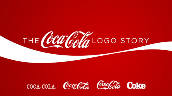
Similarly, you’ll note an interesting thing about Coca Cola’s logo:

coca cola logo

Despite changes in the font of the logo over time, the one thing that remained consistent about Coke’s logo is the color red.

That’s because our brains process visuals 60,000 faster than text, which is why colors get imprinted on our minds.

Coca Cola’s red logo portrays love and happiness (which only true Coke addicts can understand!).

It’s one of the few brands that has pulled off marketing an intangible feature of a tangible product.

#2. Yellow: Yellow is thought to be the happiest color on the spectrum, and it is linked to the increase in positive and friendly feelings. In marketing, yellow is used to represent clarity, optimism, and creativity.

For this very purpose, yellow is marketed towards a younger audience, as it is the color that infants react to the most.

It is among the most psychologically complex colors on the spectrum and stands out quite a bit.

Using the right balance of yellow can succeed in gaining attention from window shoppers.

Yellow is used by DHL, IKEA, and CAT. If yellow is used excessively, then it can signify fear, caution, anxiety, and even irrationality. That’s why so many hazard signs have yellow backdrops!

dh logo

Men tend to prefer yellow more than women, and it can be even more effective if it is used with darker colors.

#3. Blue: The psychology of color blue in marketing is thought to curb appetite and lend an air of sophistication to a brand. It promotes a sense of security and is often used in office spaces to impart an air of calmness.

Blue is a very non-invasive color, and in gendered marketing, it is targeted primarily towards men.

The color blue is used to retain a greater number of customers and increase brand loyalty. It is used most famously by Facebook, JP Morgan, LinkedIn, and Dell.

Excess usage of the color blue can make the branding look cold, unfriendly, or even emotionless.

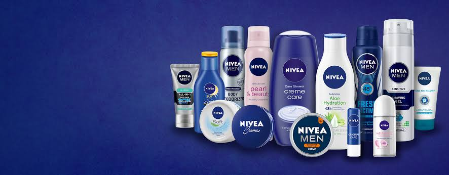
 For instance, Nivea heavily uses dark blue for a wide range of its products. Note how some products targeted towards women like Pearl and Beauty are predominantly colored baby pink.

nivea logo

#4. Orange: Orange is used to signify enthusiasm and warmth.

Brands that use orange as their major color can be associated with economically priced goods.

Orange can be utilized like a call to action as it instills shoppers with a sense of urgency. Thrift stores like Payless, Home Depot, and Amazon make use of orange to entice impulsive shoppers.

payless logo

An overindulgence in orange can negatively impact branding by signifying frustration, immaturity, and even sluggishness. Orange is a pretty gender-neutral color, but women tend to dislike it more than men.

#5. Green: The color green is meant to showcase health and tranquility. It can even be used to imply new growth or signify wealth.

Generally, it can be used in marketing for eco-friendly, or healthy brands. Green is used by the Holiday Inn, Land Rover, and Whole Foods.

whole foods market logo

The color green, if used abundantly, can have some negative connotations like envy, boredom, or even stagnation. Green has some gender disparity, with men preferring it substantially more than women.

#6. Purple: The color purple denotes royalty, success, and wealth. It is said to have a calming effect in marketing and is used by cosmetic brands quite frequently.

Purple lends an air of sophistication and luxury to any product and it is used by Cadbury, Hallmark, and Syfy.

cadbury logo

Purple in large quantities is thought to indicate moodiness or even suppression, so it is important to not go overboard with this particular color.

Purple is shown a clear preference by women and additional tints to it can make it even more feminine.

#7. Black: Black is used to enhancing a company’s sense of sophistication, class, and power. It is a relatively subdued color that is still quite attention-grabbing.

It can be marketed towards consumers that are a bit more reserved.

High street brands like Hugo Boss, Puma, and Gucci use this color heavily.

gucci logo

If black is used excessively, then it can negatively impact the branding by denoting coldness, oppression, or even mourning.

Black is quite gender-neutral and no clear preference is shown for this color. It is thought to be more suitable for some industries like fashion.

#8. White: White or silver colors can amplify the feeling of cleanliness, purity, and lend a minimalistic air to a product. In marketing, white is used a lot as a contrast and can declutter the branding of a product.

Brands that utilize the color white include Adidas, Sony, and Apple. If white or silver is used in excess however, it can give off a sterile or empty feeling, so it is important to use white sparingly.

As white is a fairly neutral color, it is not particularly liked or disliked by either gender.

The Adidas logo is super simplistic, which highlights the minimalistic and functional element of the sports brand. Set against a backdrop of black, the white becomes much more eye-catching.

adidas logo

#9. Magenta: Magenta, or pink, is the color that is most highly associated with femininity. It can also be used with other colors to add a more youthful look to the brand.

Magenta is a positive color and can inspire consumers with imaginative, caring, or creative air. If used in excess, however, it can signify impulsivity or rebelliousness.

Some brands that make use of magenta include Barbie, Victoria’s Secret, and Cosmopolitan.

barbie logo

Why the Psychology of colors in marketing doesn’t always work

Although it may seem fairly simple to make use of the psychological effects that individual colors invoke, the color theory can be up for debate. The fact of the matter is, the effect of each color can have a vastly different impact which depends on an individual’s own set of experiences. Aspects such as culture, preferences, and even upbringing can result in the same colors having vastly different effects on people.

For instance, the color green is said to instill a sense of calm and tranquility in a person. However, its effect is highly reliant on the context it is being used in. Green can, therefore, be used to bring awareness to environmental issues or it can also be used to signify wealth and finances.

Similarly, brown can give off a rugged appeal for brands like Hollister. In different contexts, it can be used in collaboration with other colors to give a more inviting or indulgent feeling like chocolate advertisements.


The important thing to remember is that there are no best colors to use in marketing. However, there are ways to decide which colors will suit your brand the most.

Choosing the right color for your brand

When choosing the color for your brand, you should pick something that fits your product or signifies what your company stands for. In order to make the best decision, conducting a small customer survey can really help you understand which colors the majority of your audience react positively towards. Consumer research will help you get a better understand of the psychology of colors in advertising and marketing, including how to use the psychology of colors in marketing and branding.

To get a better understanding of this you must answer some questions:

#1. What does your brand stand for?

In choosing a color for your brand, you should take note of your brand’s personality. The colors of your choosing should align with what the brand stands for.

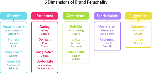
To pick the right color, you can try to figure out which niche your brand fits in. Does your brand’s personality denote sophistication, excitement, competence, ruggedness, or sincerity?

#2. What is your brand’s target audience?

Another major point of note is your brand’s audience. Is it comprised mostly of men or women?

Different colors in the spectrum can target different genders. It is up to your discretion whether your brand would benefit from sticking to the gendered norms or if it went against the norms and chose colors that can improve your brand’s individualistic nature.

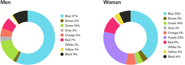
The figure below outlines the colors that are favored the most by men and women:

graph showing popular colors that attract attention from men and women.

#3. What is the branding color of your major competitors?

Another way to stand out amongst the crowd is to make note of the branding colors of your competitors. By choosing colors that are dissimilar from your competition, you can carve your brand’s niche in the market and create your own audience.

For instance, the main branding colors for McDonald’s are red and yellow, but Taco Bell’s colors are purple. Taco bell, which became a fast food chain much later than McDonald’s, made use of the purple more predominantly so it could stand out when compared with competitors like KFC and McDonald’s.

mcdonalds and taco bell logo

#4. What are the names of the colors you are choosing to represent your brand?

Colors do have a major impact on a consumer’s first impression. But the name of colors can also elevate your brand substantially.

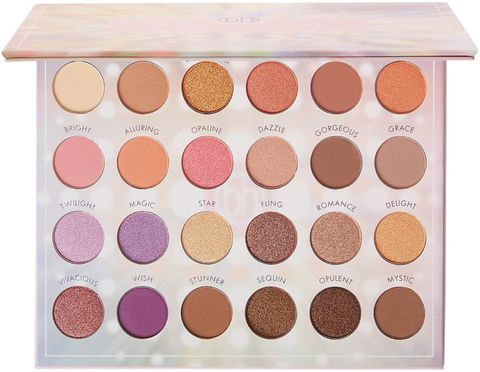
For instance, although the colors brown and mocha are essentially the same, consumers being surveyed favored the color mocha more. This trick is used often by makeup and cosmetic brands to improve a brand’s relatability and attractiveness.

For instance, the makeup palette pictured below has a wide range of shades that can be used for everyday looks. Yet colors like lilac are named “Magic” and other neutral colors like brown are called “Stunner” or “Opulent” or “Mystic”.

Naming the colors like this can lead customers to react to the palette in a more positive way. It can also make the product more attractive as compared to a palette with simple shade names like brown or blue.

make up showing the psychology of colors in marketing

Choosing the Right Color Schemes for your brand:

#1. Monochromatic: Making use of a singular color in varying shades can be easy on the eye, and is often used online. It can give your brand a minimalistic yet sophisticated design.

#2. Complementary: This particular strategy employs two colors from the opposing ends of the color wheel. This can draw onlookers and is suitable for your brand if you want to show off a wider range of products.

#3. Triple Color Scheme: This method uses three colors that are equally spaced on the color wheel. The usage of such colors can showcase a harmonious effect. It can be implemented to create a bolder outlook for your brand.

Perception of Color:

Color studies show that varying tints and shades can induce different reactions from men and women. Adding black to colors can result in darker shades while adding white to colors results in softer, lighter shades.

Males reacted more positively to bright colors and females favor soft colors

The results of using the psychology of colors in marketing:

It cannot be said that color is the sole deciding factor that can lead to your brand’s success. This is because it is a combination of marketing techniques and online branding techniques that can ultimately help your brand be successful.

It is, however, undeniable, that making use of the psychology of colors in marketing can help your brand receive much-needed recognition. Various studies conclusively state that ads that are colored perform 42% better than those same ads without color. Brands that understand the psychology behind colors in marketing have recorded significant success when they launch a new product.

Ultimately, nearly 80% of consumers hold the belief that colors help make a brand gain more recognition while 90% of consumers state that their first impression of a brand or product was based largely on color. The colors that you choose to identify your brand with can even influence a consumer’s retention and purchasing patterns. 52% of customers will not return to a store if they don’t like the aesthetic of the store.

Marketing on online platforms is widely different from in-print marketing. Make sure to do your research and learn how to appropriately market your e-commerce venture.

What is the psychology of colors in marketing?

Color theory can be used to influence a customer’s desire to enter your store or buy an item. The look, color, texture and feel of a product can affect consumers’ desire to buy objects by 93% or more.

What effect does the psychology of colors in marketing have on consumers?

Different colors affect people in different ways, and can be used to drive customers both toward and away different places and products. For instance, the color red symbolizes appetite, intensity and passion, and is thought to induce a sense of urgency in the onlooker.

How do I use the psychology of colors in marketing to attract customers to buy?

While you can use the color red to symbolize intensity and urgency, other colors like yellow can mean happiness, clarity or optimism. Orange is a warm, enthusiastic color that often signifies discount brands. And green can signify health or eco-friendliness, making it a good color to associate with healthy or environmentally conscious brands.

Does using the psychology of colors in marketing work?

Just making a product a certain color and expecting people to buy it rarely works, but used in conjunction with other design elements like space, shape, texture and more, you can create a winning combination that will draw people to your product.

Original Post: https://expresstext.net/blog/psychology-of-colors-in-marketing/


Thursday, 22 July 2021

The Impact of Artificial Intelligence on Corporate Decision Making

Artificial intelligence was primarily a science fiction subject for decades, but it has dramatically changed nearly every industry over the past years and decades. In fact, the percentage of businesses that use or plan to use AI rose from 10 percent to 37 percent in just four years from 2015 to 2019.

In this article, we’ll take a look at how artificial intelligence and services such as the ai-powered bi tool are changing the way businesses around the world approach key organizational decisions. While we’re only beginning to scratch the surface of artificial intelligence, it’s clear that AI will play a major role in both consumer and business applications throughout the 21st century.

AI and Efficiency

Before artificial intelligence and machine learning tools were widely available, businesses often had to invest substantial resources into research and data collection. These were far more expensive and time-consuming than contemporary AI solutions, and they were at a significant disadvantage when it came to the results.

Today, companies that leverage AI and ML can make more accurate and agile decisions at a fraction of the cost. While these implementations work differently in each industry, artificial intelligence is transforming common practices in nearly every field.

AI in Healthcare

Healthcare is the perfect example of a sector that was waiting to be transformed by AI. By nature, healthcare organizations work with large volumes of patient data—including extremely sensitive information that’s governed by HIPAA and other regulations.

With AI, healthcare organizations can analyze an incredible amount of data and use it to find patterns that wouldn’t be identified by human employees. With that in mind, it’s no surprise that the healthcare AI industry is expected to grow by more than 40 percent per year from 2021 to 2028.

Implementing AI and Predictive Analytics

If you want to get the most out of AI and predictive analytics, you need to fully commit to understanding and leveraging those technologies. This can require significant time and money upfront, but the returns are well worth the investment.

Artificial intelligence will never replace human input—the way you implement AI systems into your practices will determine your long-term results. Effective implementation of artificial intelligence, machine learning, predictive analytics, and other cutting-edge technologies depends on buy-in at every level of your organization.

AI is growing rapidly every year, and companies that fail to adapt will quickly fall behind the competition. 

Tuesday, 20 July 2021

HOW iOS 15 RELATES TO APP DEVELOPERS

It's no secret that Apple updates usually bring about a load of work for app developers, and this iOS 15 beta version that was just released seems to be the same. 

iOS 15 has many new features that improve on the iOS 14 and make life easier for its users. These include the Focus mode, Live Text (which allows users to transcribe, copy and paste from images and camera in real-time), improvements to system apps like FaceTime, Safari, Siri, Apple Maps, and AppleWallet. All this sounds impressive and probably would make a person eager to update their iOS when it's rolled out officially sometime in Fall 2021. 

Apart from these impressive things, how does this iOS relate to developers? What impact will it have on their work?


1. Increased Memory Limit

Increased Memory sounds too good to be true. Still, it's a boon from the Apple gods for third-party app developers, as the document from developer.apple.com reveals that app developers can ask for extra memory access in special circumstances. While it's not so clear what those circumstances are, developers can look forward to designing apps with graphics that are even more detailed and in-depth. 

This feature also comes with a caveat, developers. Apple says to make sure that your app still functions properly even without the extra memory space, as they may not give this permission to everyone.


2. SharePlay 

SharePlay is Apple's cool new feature on FaceTime which allows people to share what they're watching or listening to with the people they're on FaceTime with. This tool is a good way to build visibility for your app, and media streaming apps can let users share their content through the new Group Activities API. Sharing also extends beyond video streaming. Users can share anything on SharePlay.


3. Focus 

The new Focus mode allows users to delay receiving notifications to times that work best for them. There are 4 Interruption Levels that developers can use to build apps or plug-ins to help with the more nuanced delivery of notifications.


4. RealityKit 2 

Apple's RealityKit has been upgraded, with the capability for you to build more immersive Augmented Reality experiences. They have added more post rendering effects and custom shaders to enable the AR to work smoothly without any lags. 

There's the Object Capture that helps you turn photos into 3D models that you can optimize for AR, Custom Shaders that blend virtual content with the real world to make it almost indistinguishable from reality. You also get more control over the rendering pipeline with an array of custom render materials to fine-tune the look and feel of your AR world. 

The Swift API allows you to create characters that the players can control to explore your AR world. 

The RealityKit 2 sounds like something every AR developer would love to try their hands on.


5. App Store 

The app store is not a part of the development process per se, but it's a great way to get your app visible to all Apple users. Apple has redesigned their app store with all-new features like their In-App Events, which help you publicize whatever event or promotion you're having on your app right in the app store. They curate personalized recommendations for their users, and these events will show up on these lists, in search results, and on the app product page. You can manage your App Store Connect and check how your app is doing on the Analytics page. 

You can also create custom pages for your app with different promotional texts and screenshots and direct relevant audiences to a particular page using its unique URL. There is also room for product page optimization on the new app. 

As with every new version of every operating system, the iOS 15 has updated and upgraded features that will make the lives of its users a little easier.  These features will spark the creative minds of their developers to make better, more technologically relevant, and aesthetically (graphically) pleasing apps and plug-ins. 

It's time for developers to make hay while the sun shines and get to work on the new versions of their apps optimized for this new version of the Apple iOS.


Sources: 

1. https://www.google.com/amp/s/www.forbes.com/sites/davidphelan/2021/07/09/apple-ios-15-reveals-1-super-cool-trick-for-dazzling-iphone--ipad-apps/amp/  

2.https://www.apple.com/ng/newsroom/2021/06/ios-15-brings-powerful-new-features-to-stay-connected-focus-explore-and-more/ 

3. https://developer.apple.com/ios/

4.  https://developer.apple.com/app-store/whats-new/

5. https://www.cnet.com/google-amp/news/ios-15-public-beta-release-date-new-features-and-more-about-apples-new-os/