Wednesday, 31 May 2017

Why Snapchat Marketing Stinks Big Time

entrepreneur.com
Poor analytics and expensive ad costs are at the top of the list.
Why Snapchat Marketing Stinks Big Time
With the implosion of standardized media into a fragmented network of varying niche-focused platforms, digital marketers must be constantly on guard and aware of burgeoning social tools for distributing brand messaging. Given the quantity of social media, blogs and content curation sites, marketers must be shrewd in discerning what platforms best serve their needs and connect with their target audience. After all, there are simply too many outlets available to spend time marketing on all of them.
One of the latest up-and-comer social platforms to gain attraction from marketers is the photo and video-sharing app Snapchat. Snapchat allows users to upload photos and videos, which they can share with their friends. What makes the app unique is that the content “self-destructs” after viewing, vanishing without a trace. This is the app’s appeal.
Given the horror stories that arise from boss’s stumbling across old Facebook content, or celebrities receiving backlash over something they tweeted five years ago, it’s no wonder why the ephemeral nature of Snapchat’s messaging is appealing to millennials who desire free expression without having their every whimsy and off-hand comment inscribed in stone.
But, while the short-lived snaps appeal to users, it’s not the best for marketers. Nevertheless, many brands have started using Snapchat for marketing ventures. The tool does have its benefits. It allows brands to engage in one-on-one communication with their audience. It’s also still seen as cool and can help humanize a brand and make it seem more authentic. Taco Bell has also demonstrated the tool’s viability as a successful channel for contests and giveaways. Plus, the majority of Snapchat users hail from the coveted millennial demographic, with 41 percent of 18- to 34-year-olds using the app.
While Taco Bell and others have achieved big things with Snapchat, there is also a vocal group of digital marketers, myself included, who find Snapchat less than ideal. As the CEO of a digital marketing firm, I am constantly exploring new venues for audience engagement. I initially found Snapchat to have a lot of potential. After all, visual content is huge right now, as is all things mobile. Also, in Snapchat’s defense, they have recently attempted to remedy some of their major issues, such as re-sharing content (Snapchat memories), the short life of content (Snapchat Stories) and poor means of promoting discovery (new search function). Even though Snapchat is moving in the right direction, in my opinion, the app still doesn’t cut the mustard.
Let’s take a look at some of the biggest problems still plaguing Snapchat marketing.

Poor analytics reporting.

For a platform to be useful as a marketing channel, there must be a simple way of calculating ROI and measuring the success of a campaign. This is not the case with Snapchat. To gauge success and glean metrics from Snapchat requires a lot of manual calculations -- which for larger campaigns results in a huge time cost.
As Snapchat continues to grow as a marketing platform, it is likely it will provide a means of analytics tracking, but in the app’s current incarnation, it’s simply not useful. You don’t know the number of people following you or viewing your snaps. So if you can’t measure engagement or a snap’s success, what’s the point? The lack of information provided not only makes it difficult to determine ROI, but also inhibits evolution of content strategy within the platform.
Third party apps for tracking Snapchat analytics, like Snaplytics, do exist, but plans are subscription-based and expensive. Considering the cost of content creation, ads and analytics tracking, successful marketing on Snapchat quickly becomes expensive. Which brings me to my next complaint.
Advertising on Snapchat is super expensive.
Snap Ads campaign rates begin at $10,000 per month. This obviously does not include the cost to create the content or third party analytics tracking.
Aside from basic Snap Ads, Snapchat also offers brands the option to sponsor lenses and purchase premium ads positioned at the top of the app, which they call Snapchat Discover Ads. Pricing breakdown for the sponsored lenses and Discovery ads are as follows:
Sponsored lenses (lasts 24 hours)
  • $450,000 a day (Sunday – Thursday)
  • $500,000 a day (Friday and Saturday)
  • $700,000+ (Holidays and events)
Discover ads
  • $50,000+
Needless to say, advertising on Snapchat isn’t for the faint of heart.

10 second video max.

While users may appreciate the 10-second cap on video content, as a marketer, I do not. Relying on 10-second video clips to engage and build an audience seems like a self-inflicted handicap, especially considering what other platforms like Instagram (60-second cap) and YouTube (unlimited time cap) offer.
The 10-second length makes it extremely difficult to create stand-alone content. Providing context to a clip will often require you to create multiple videos, which only adds to the financial and time costs. And given that the average Snapchat ad view time is less than 3 seconds, providing a focused piece of content that achieves anything at all becomes a very real challenge.
Even with Snapchat’s Stories feature, the 24-hour lifespan for photos and video leave it lacking as a strictly content marketing tool. These time restrictions also make content curation nearly impossible, although there are several workarounds for this issue, albeit manual and time-intensive.
While Snapchat does allow you to get in front of a large audience, it does little to facilitate actual communication in any way.

Limited search and discovery capabilities.

Before January 2017, Snapchat only allowed users to search for other user accounts. This limitation did little to facilitate the discovery of new content. They’ve since rolled out a new universal search bar. While this addition is a huge improvement and does help users better locate what they’re looking for, it still does little to promote the discovery of new content.
Unlike Facebook or Twitter, Snapchat has no means of enabling friends to suggest content to other friends. This makes it very difficult for a company without wide scale brand recognition to build an audience.
No outbound linking.
In Snapchat’s current form, there is no opportunity to drive traffic away from Snapchat by means of outbound links. Thus Snapchat is somewhat useless aside from top-of-the-funnel efforts such as audience engagement.
Personally, I don’t see the point in marketing on a platform that makes it so difficult to drive traffic to your site. While this limitation can be overcome by strong and captivating CTA’s, given the aforementioned short attention span, this is easier said than done.
Thankfully, Snapchat has rolled out a “deep link” feature for beta testers in January, which allows users to swipe up and select a URL provided by the content creator. But this feature has yet to be rolled out across the board.
While I am not a fan of Snapchat marketing in it’s current state, I will certainly keep an eye on the improvements and updates they make. If they unveil a more robust analytics reporting system and drop the cost a bit, maybe I’ll reconsider marketing on their platform. But as it stands, Snapchat marketing just isn’t there yet.

3 Ways Brands Can Accelerate Their Reach Beyond Ad Blockers

martechadvisor.com
3 Ways Brands Can Accelerate Their Reach Beyond Ad Blockers
Consumers’ use of ad blocking technology is on the rise, which could spell trouble for both online publishers and advertisers. Jayson Dubin, CEO at Playwire shares tactics brands can take to accelerate their reach beyond ad blockers
Ad blocking is on the rise. Eleven percent of internet users globally downloaded ad blockers last year, representing a staggering 30 percent annual increase. Perhaps more troubling for brands is that among global users, two out of three U.S. Millennials, a group that represents more than $600 billion in annual spending power, use an ad blocker on a desktop or mobile device.
When we look at why this is, the reason is not surprising: people feel bombarded by intrusive, disruptive, and irrelevant online advertisements. But there is a bright spot. A large majority of online users (83%) believe that not all ads are bad, and instead of opting to block all ads, they would prefer the option to filter out ads that are offensive or not relevant to them.
We also know that when users do click through an online ad, it’s most often because the ad interested them in the moment; they need new sneakers and a Nike ad happened to be served.
By bringing together what we know makes users click (relevancy, timeliness) and what we know makes users block (intrusive, disruptive), brands can begin to formulate better ways to accelerate their reach beyond ad blockers. At a high level, viewers will be more receptive to advertising if brands--and publishers--invest in creating seamless ad experiences that fit naturally within a viewer’s online experience. What does this look like in practice? We’ve outlined three methods here.
In-app advertising
Eighty-four percent of all smartphone time is spent in-app, making engagement here critical for brands, and a recent study conducted by IHS and commissioned by Facebook Audience Network suggests that third-party in-app native ads will account for $8.9 billion by 2020, growing at an annual rate of 70.7%. Compared to other formats, native ads tend to produce higher levels of engagement, shares, and up to 3x user retention.
Native ads are a natural fit for in-app, as they can be tailored to align naturally within the content of the app. When brand advertisements actually become a part of the app, they become immediately relevant to a user. Similarly, in-app advertising allows brands to very specifically target users, ensuring that ads served are relevant.
Remember, in-app doesn’t just mean mobile. A number of users engage within apps via desktop as well, providing an opportunity for brands to experiment with new creative and ad formats.
In-game advertising
Online gamers tend to be more accepting of advertisements served in-game because they are presented fluidly, as part of gameplay. Generally speaking, if a game is free users are more accepting of advertising, but it needs to uphold the tenets of good advertising: non-intrusive and seamlessly sewn into the game experience. For example, if watching an ad gives a user free “cash” in EA’s Madden Mobile, the user is incentivized to watch an ad to completion. Another creative approach to in-game advertising is creating a game within a game; if the ad is a mini-game, it is less likely to be viewed as intrusive or disruptive.
In-store advertising
Here we are talking about the “third-screen” experience, when retailers have their own programming networks in-store. Typically, this type of out of home advertising feels very native and seamless because it’s hyper-relevant to the consumer already in the store shopping. Think about it, if CPG brands are advertising in Target’s in-store programming, it’s likely that those ads will drive sales as shoppers are already shopping for their products. Similarly, if video game brands are advertising on GameStop’s TV network, those ads will reach users who are already interested in gaming.
For brands to combat ad blockers and reach their target audiences, it really comes down to serving relevant ads in a manner that fits with the medium. That means advertisements that don’t disrupt or intrude on user experience, and ideally, enhance audiences’ brand perception. As the industry as a whole works toward creating better brand advertising experiences, in-app, in-game, and in-store advertising all represent avenues brands can take to accelerate their reach beyond ad blockers.

Tuesday, 23 May 2017

Deliver An App-Centric Experience, Enable An Innovative Ecosystem

channelpartnersonline.com
By Paul Verhoeven

Apps have transformed the ways we consume products and services. Today, from a simple app, you can order a ride with complete end-to-end visibility into your journey and gain access to quoting, pricing and billing in a single instance, on-demand and across much of the globe.
Enterprise employees have come to expect the same seamless experience from networking.

I believe that this app ecosystem provides a large opportunity for channel partners to effectively meet new customer demands. An “app-centric channel" would allow partners to make a variety of services available to customers, all via mobile-app-store-type models. Enterprises would gain simple access to a tailored portfolio of services; bundles could include anything from networking and cloud communication to storage and backup. Customers will benefit from a rich and growing ecosystem where they can access on-demand connectivity services that are agile and flexible. They will be able to rely on networking to support their growth, no matter where it is happening.

Through the combination of cloud, virtualization, on-demand connectivity and back-office automation, channel partners eventually should be able to connect, deploy and manage these services all within an app store-type environment. We’ll use APIs to deliver an on-demand ecosystem that brings together different communications services into a single location.

Overall, the communications market will be more vibrant and exciting than it has ever been. An app-centric model will provide a foundation for a new era of innovation, where the channel accelerates access to new applications and services, new levels of performance and new experiences in ICT.
[App Centric Demands NFV: The mechanics behind an app-store model? NFV and SDN. Services delivered in a software-defined model — from firewalls to UC to SD-WAN — represent significant opportunity for channel partners. In this free Report, we provide a primer. Download now!]
Let’s face it, today networking is impeding innovation within the channel model rather than enabling it. Capitalizing on the explosion of cloud, real-time communications, machine-to-machine communications and the Internet of Things (IoT) demands network services that go beyond what is being offered by the traditional networking model.
The network is the weak link that is slowing services development and putting barriers up that limit channel partners’ growth.
The Benefits of Change
I see five unique ways that channel partners and their enterprise customers will benefit from this new model:
  1. Accessibility: Making networking services available via mobile app store-type models enables channel partners to provide their enterprise customers with limitless accessibility. Eventually, customers will be able access all of their applications and services directly from their smartphones, anywhere around the world.
  2. Simplicity: By creating an app-centric channel, the complexities inherent in the current model will be removed. Channel partners will have the option to cherry-pick from a number of different networking solutions, selecting those that best suit their enterprise customers’ needs. The whole procurement and deployment process is simplified to a few simple finger taps.
  3. New agility: Partners are able to compete with new efficiency and grow their businesses outside a particular geography or vertical. With a minimized need for close operational management, partners regain critical time to focus on other core areas of their businesses, like customer service.
  4. Rapid time-to-market: With the ability to connect, procure and manage via a centralized app ecosystem, channel partners are able to deploy new applications and services within the marketplace faster and with greater efficiency. That will allow them to meet new customer demands quickly, while staying ahead of competitors in the same space.
  5. Reduced customer churn: By providing a centralized app-ecosystem for all enterprise customer needs, channel partners can reduce churn. Customers will be able to get everything that they need from a single location and will no longer have to manage multiple supplier relationships.
Applications that provide on-demand access to everything networking are the future. When speaking with suppliers, it’s time to ask when they will remove inefficient manual processes from procuring services.

Monday, 22 May 2017

Mobile Tops Digital Ad Spend At $36 Billion

mediapost.com
Image result for digital advertising
For the first time, more than half — or 51% — of the record $72.5 billion spent on digital advertising in the U.S. last year was on mobile ads, according to a report conducted by PwC US for the Interactive Advertising Bureau (IAB).
First reported by The Wall Street Journal, those numbers represent a 77% surge of spending on mobile advertising to $36.6 billion last year, according to the IAB. Digital ad spending in general grew 22% in the U.S. from the previous year.
“Brand dollars naturally follow consumers, and you’re starting to see a mobile-first, and sometimes a mobile-only mind-set among marketers,” David Doty, the IAB’s executive vice president and CMO, told WSJ.
A big chunk of that mobile growth was driven by Facebook and Google.
Other key findings of the report include growth in online video ads, in which spending jumped 53% to $9.1 billion. Mobile video spending grew by 145% year-over-year to nearly $4.2 billion
Digital audio advertising crossed the $1 billion spending mark for the first time in 2016. Those figures also include ad revenue generated by streaming services and podcasts.
For months, the Association of Magazine Media has tracked online magazine audiences' shift from desktop to mobile devices, in its monthly Magazine Media 360° Brand Audience Reports.
In February, the report found Web audiences using desktops or laptops had dipped by 14.2% compared to the same month a year ago, while mobile audiences were up 2.9%.
Interestingly, the March report from MPA revealed mobile audience decreased by 1.3%, the first report that showed even a slight decline in mobile magazine audience.
“We continue to believe this flattening is due, in large part, to comScore’s methodology change initiated in Jan 2017, as well as an indication this platform is approaching saturation. There are only a handful of magazine brands that have yet to develop their mobile audiences to reportable levels,” an MPA spokesperson said in an email.

Thursday, 18 May 2017

App stores saw record revenue and downloads in Q1 2017

techcrunch.com

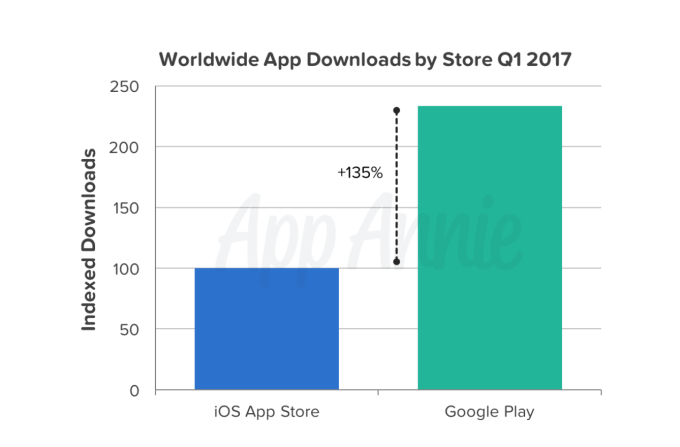
Mobile applications saw a record number of downloads and revenue in the first quarter of the year, according to a new report from app store analytics firm App Annie out this morning. Across both iOS and Android, downloads grew by 15 percent year-over-year to reach nearly 25 billion worldwide – a figure that includes only new downloads, and not re-installs or downloads from prior quarters.
In addition, consumer spend on apps also grew 45 percent year-over-year in Q1, to reach over $15 billion across iOS and Android worldwide. However, the amount of money developers are making from their apps is even higher than this, as App Annie isn’t including the additional revenue generated from in-app advertising here, or revenue from mobile commerce applications.
In terms of the increased revenue figures, App Annie chalks up much of this growth to China’s impact on the market, and specifically its growth on iOS. The country is currently number one by iOS consumer spend, and the chief contributor to iOS revenue growth. It’s estimated China will remain in that position through at least 2021, the report said.
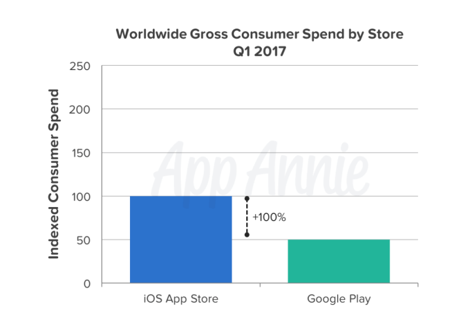
Overall, iOS continues to lead Google Play on revenue – and that distance is growing. Apple’s mobile platform increased its lead to 100 percent over Google Play on this metric in the quarter, up from its 90 percent lead in Q1 2016.
Of course, we know that looking only at the differences between iOS and Google Play doesn’t paint a full picture of today’s app market – as App Annie itself reported last month, Android is poised to top iOS in app store revenue this year, when you count the third-party Android app stores in the forecast. And given the importance of China’s position in the market, you must. These alternative Android app stores – which include marketplaces offered by Tencent, Baidu, Xiaomi, Huawei, and others – are expected to reach $20 billion in revenue in 2017.
Despite iOS’s lead, Google Play consumer spend did pick up steam in Q1 2017, having shown strong growth of 40 percent year-over-year.
While emerging markets like India had fueled download growth (especially on Google Play), it was established markets that led to the revenue growth. In particular, the U.S. and South Korea saw the greatest growth in market share of worldwide Google Play consumer spend, but the U.S. and Japan saw the largest absolute growth year-over-year.
Several European markets also impacted consumer spend across both iOS and Android in the quarter, including the U.K., Germany and France, which each ranked in the top 10 for consumer spend on both app stores. That’s not a new occurrence, though – App Annie notes this trend has been ongoing over the past five years.

The Importance of a Responsive Website [INFOGRAPHIC]

top10-websitehosting.co.uk
There are many reasons why having a “responsive website” is such a key element to any website. Having a site that is responsive means that your visitors can browse and find information regardless of the type of device that they are using.
This is both crucial for the overall user experience and conversions. This infographic highlights some of the key statistics that really show the importance of having a mobile friendly website. In the US 55% of internet traffic is coming from mobile devices and this continues to increase every year.

Tuesday, 9 May 2017

How to Make the Perfect App Icon

appinstitute.com
How to Make the Perfect App Icon
With just 24 app icon slots on the first page of an iPhone home screen, or 28 if you have a fancy iPhone 7, creating the perfect app icon is a vital step in user adoption.
I once met someone who had an app icon containing every letter of the alphabet on his homescreen, but that zany aesthetic is hardly for everyone – for the average downloader, app icons represent the first encounter users have with a new app. So it needs to be a good one!
If your app icon is ugly, users will either delete the app or hide it away in a folder somewhere that they might forget about it. Unfortunately, this is one area in which looks really do matter. So what can you do to make sure that your app’s icon is the homecoming queen and not the shy girl next door?

Stick To Popular Colours

There are various articles out there dedicated to the science behind choosing a colour(s) for your app icon. One helpful soul has even created the follow diagram of the most popular colours for app icons:
app icon colour chart
Source: GraphicMac
The implications of this are twofold: using primarily red, blue or maybe green for your app icon is a fairly safe way to go. On the flipside, you could choose a pink, purple or yellow hue to stand out from the crowd a little more.
Obviously, there are advantages and disadvantages to each of these routes. What’s safe and familiar also risks being forgettable, while breaking the mould carries the risk of looking too different and not blending well with other apps.

Use A Letter (Or Don’t…)

letter P app icons
Source: PXLR
From Facebook’s ‘F’ and Hotels.com’s ‘H’ to Dailymotion’s ‘D’ and Skype’s ‘S’, there’s no shortage of apps out there that use the first letter of the company’s name in their app icon.
While that’s undoubtedly a smart and straightforward move, it’s not without its risks if the name of your app starts with a very popular letter.
Think about the apps already out there, particularly if you’ll be competing directly with them, and go a different route if you’re concerned about being confusing or overly similar.
Maybe, given Skype’s longstanding associated with the letter ‘S’ in a cloud, that’s what prompted Skyscanner to come up with this neat little abstract symbol for their app icon.
skyscanner logo
Using a letter is a very safe choice, especially if your app logo has a distinctive font associated with it.
Take that distinctive Facebook ‘f’, for example, which is instantly recognisable thanks to the company logo’s ongoing association with a modified version of the Klavika Bold font.
But, as a company, it seems even Facebook can’t decide whether letters or symbols are best for app icons. Why else would they have channelled their inner Harry Potter when coming up with a icon for Messenger instead of using an ‘m’ in a speech bubble?
messenger app icon

Use A Coherent Colour Scheme

If there’s one thing worse than an ugly app icon, it’s a beautiful app icon that opens up to reveal an unappealing or dated looking app. First impressions are important but, if you can’t live up to the high standards set by them, you’ll fail anyway.
Hat tip to Dan Counsell, who gave the following examples of how Ember and Clear keep their experience consistent all the way from opening the app to actually using it:
Ember and Clear App Icons
Source: Dan Counsell
But that’s not to say that everything has to be exactly the same, though.
Take Words With Friends, for example, which added a heart and shamrock to their app icon for Valentine’s Day and St Patrick’s Day respectively. A nice way to stay relevant, for sure…as long as users update their apps regularly enough to see it in time.
And then there’s their educational offering:
words with friends edu icon

Reflect Your App’s Purpose

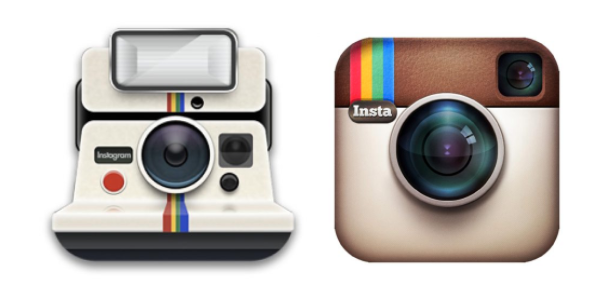
Do you remember when Instagram changed their icon? I do, not least because it’s something I was asked to write about for Crazy Egg. But a lot of people don’t know that Instagram had another app icon before they changed it to the brown rainbow one that everyone knew and loved:
old instagram app logos
The founder gave the following reason for the first logo change: “The old icon had nothing to do with Instagram.” With that sentiment in mind, it’s actually pretty easy to understand why Instagram decided to change their suite of logos to this:
instagram suite app icons
The vintage brown camera icon had everything to do with nostalgia, like that evoked by the flapping of a Polaroid picture, and nothing to do with the future of photography. And, with 80 million photos shared every day on Instagram, that’s exactly – whether you like it or not – what Instagram is.

Conclusion

Disappointingly, but predictably, there’s no straightforward route to creating the perfect app icon. Hence there being such a wide array of different looking icons out there!
The above tips are useful, but they’re not something you can set your watch by – an app aimed at children or teenagers will, for example, look very different to one that’s used mostly by, say, businessmen or retirees.
There’s another good place to start when you’re trying to find inspiration for app icons, and it’s probably either in your pocket or lying on your desk. Or maybe you’re reading this article on it. I’m talking about your smartphone!
Most founders, app creators etc. build products or apps to address a problem that they’ve identified in their own lives. In other words, you are probably a pretty good representation of your target market. Think about app icons you find attractive, or at least are willing to make room for on your home screen, and you’ll be on your way to app icon success.
And hey, even if you do end up creating a really ugly app icon, it could always end up generating notoriety on Reddit